Dashboard
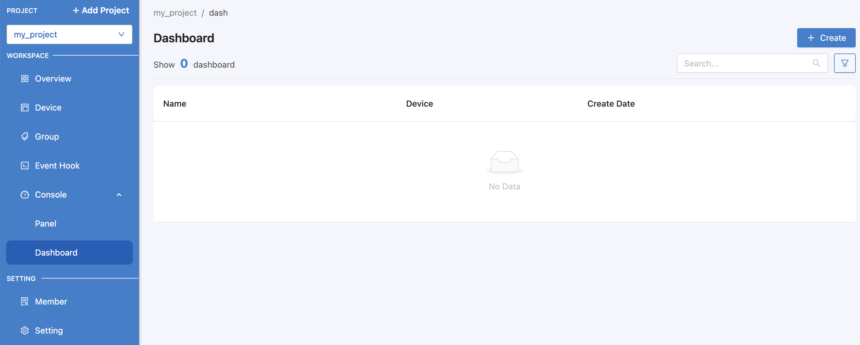
It is a part used to display data stored in the Platform, similar to Panel, but the usage difference for Dashboard is that it is more suitable for viewing real-time data and can control and command back to the device. To access Dashboard, click on the Console > Dashboard menu. The screen will appear as shown in the following figure.
Create Dashboard
From the image above, when you go to the "Dashboard" menu, click on the "Create" button in the upper right corner to create a Dashboard. When clicked, a form for filling in information will appear as shown in the image.
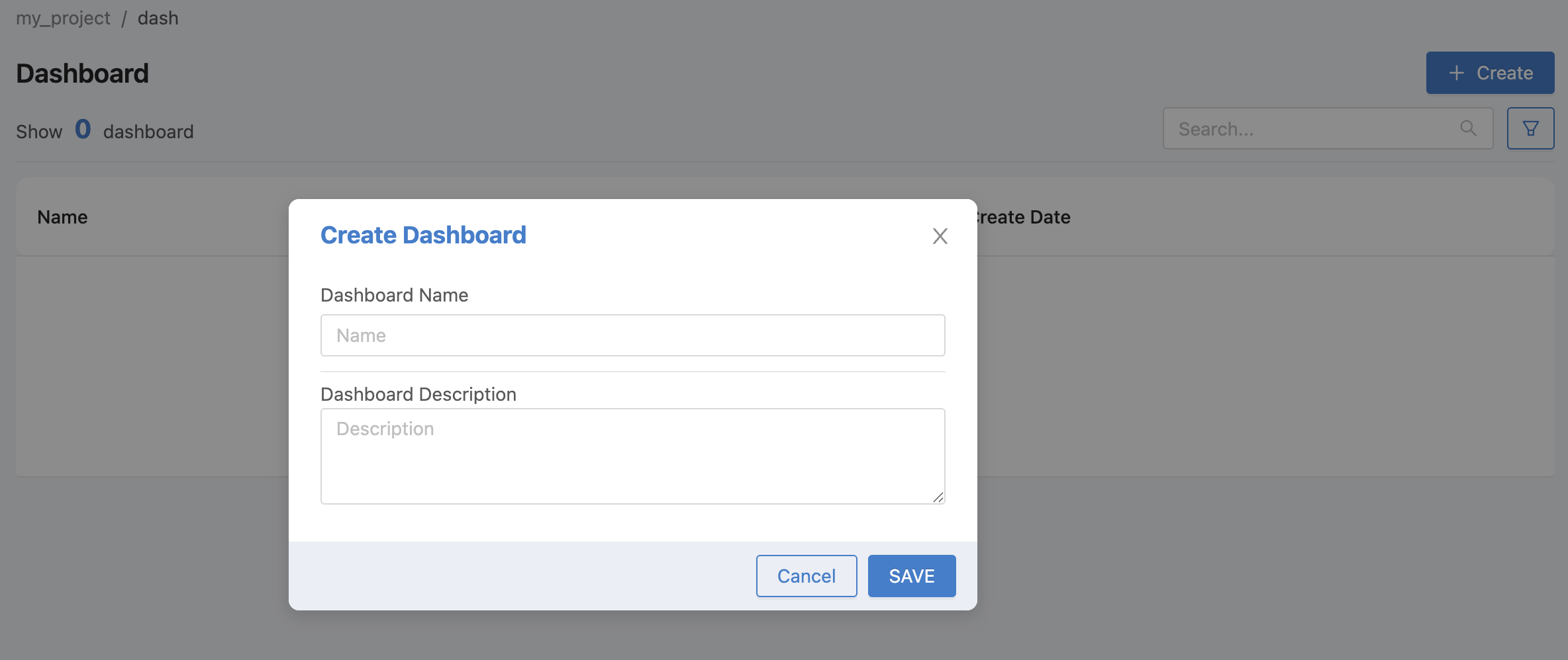
From the image above, the Dashboard data that can be identified is as follows:
Dashboard Name |
Dashboard Name |
Dashboard Description |
Dashboard Description |
When you have filled in all the information, click on the "SAVE" button, and the new Dashboard that was just created will appear, as shown in the picture.
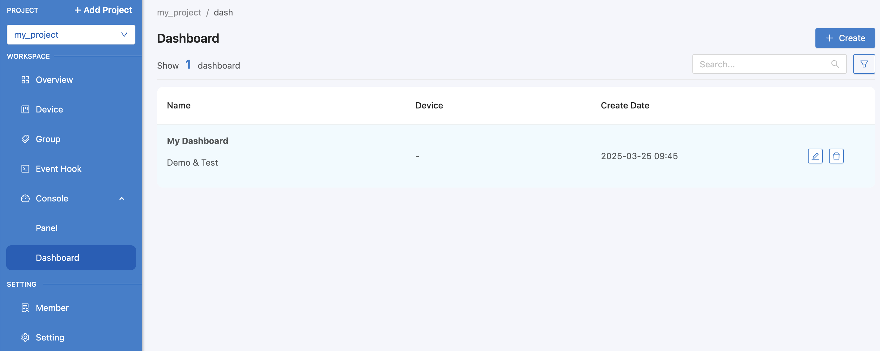
From the image above, after each Dashboard item there is an icon to edit/delete the item. To set up the Dashboard, click on each item to proceed.
Dashboard settings
For each dashboard that has been created, if you want to set up the operation or display various data, click on the Dashboard item. The screen as shown in the figure will appear.
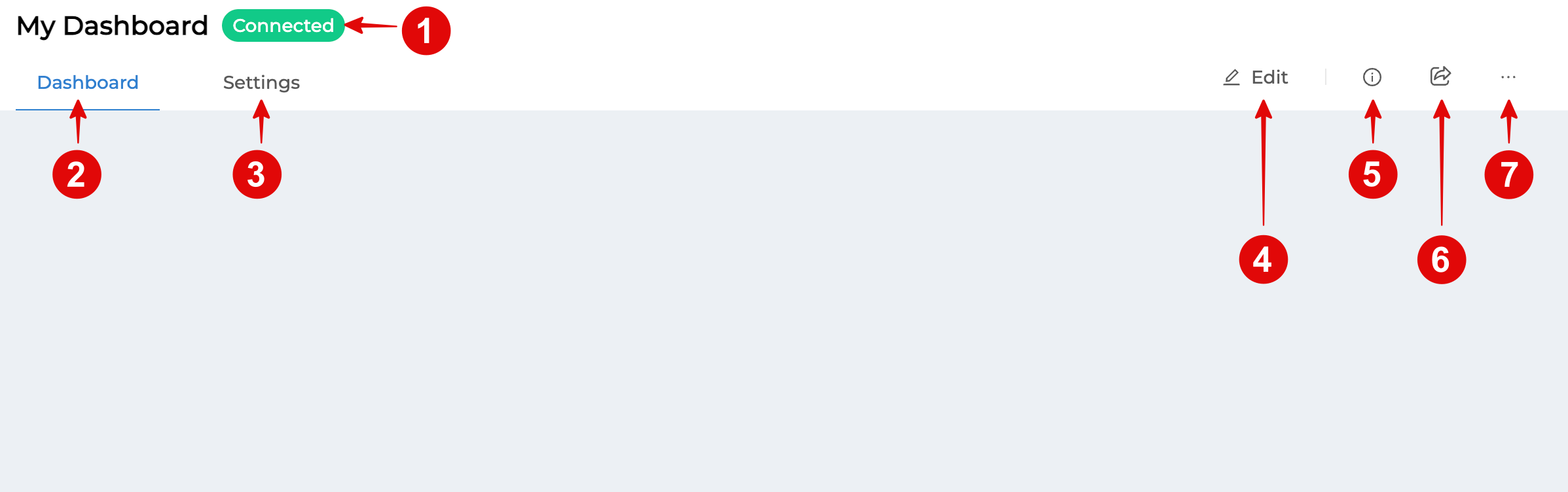
From the image above, the Dashboard settings have the following sections that can be operated:
Part 1 Dashboard Name & Status
This is the section that shows the name of the Dashboard selected for configuration and the status of the Agent that acts as a medium for communicating or exchanging information between the Dashboard and the Platform. If the status is "Connected" (colored), it means it is connected to the Platform. If it is "Disconnected" (gray), it cannot connect to the Platform. The cause may be that the device or computer used to open the Dashboard cannot connect to the internet, or it may be a problem on the Platform side, not ready to connect, etc.
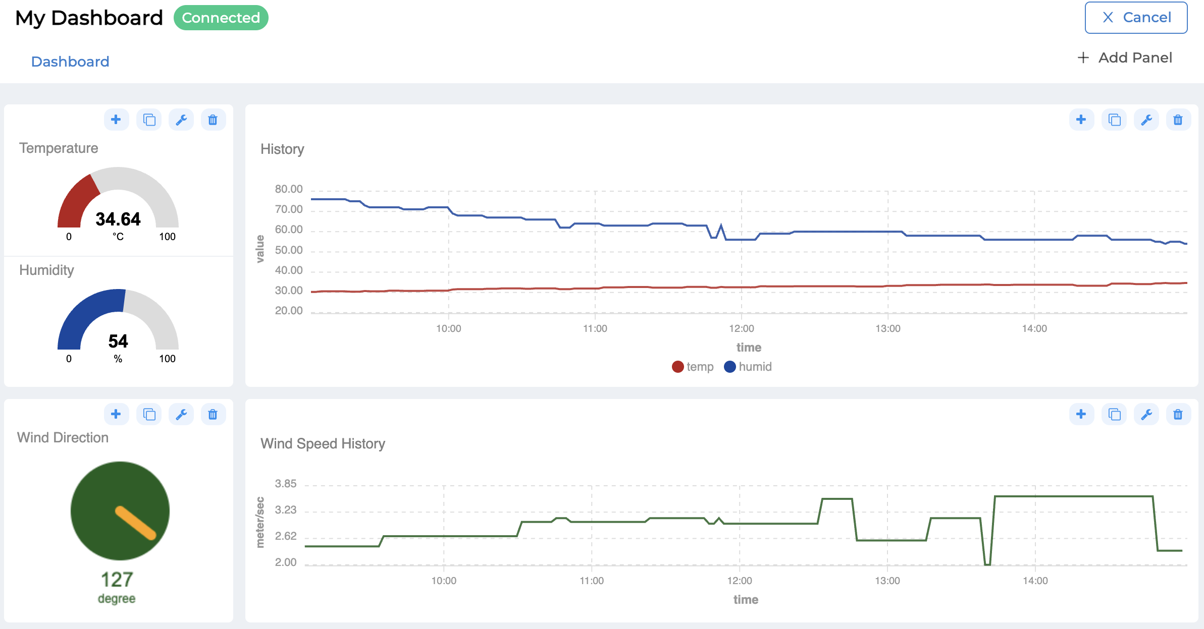
Part 2 Dashboard tab
This section is where you can display information or view the Dashboard that has been set up. If you want to edit the Dashboard, you can do so in this section as well. However, if you want to enter the Dashboard editing mode, you must click the Edit button (Section 4).
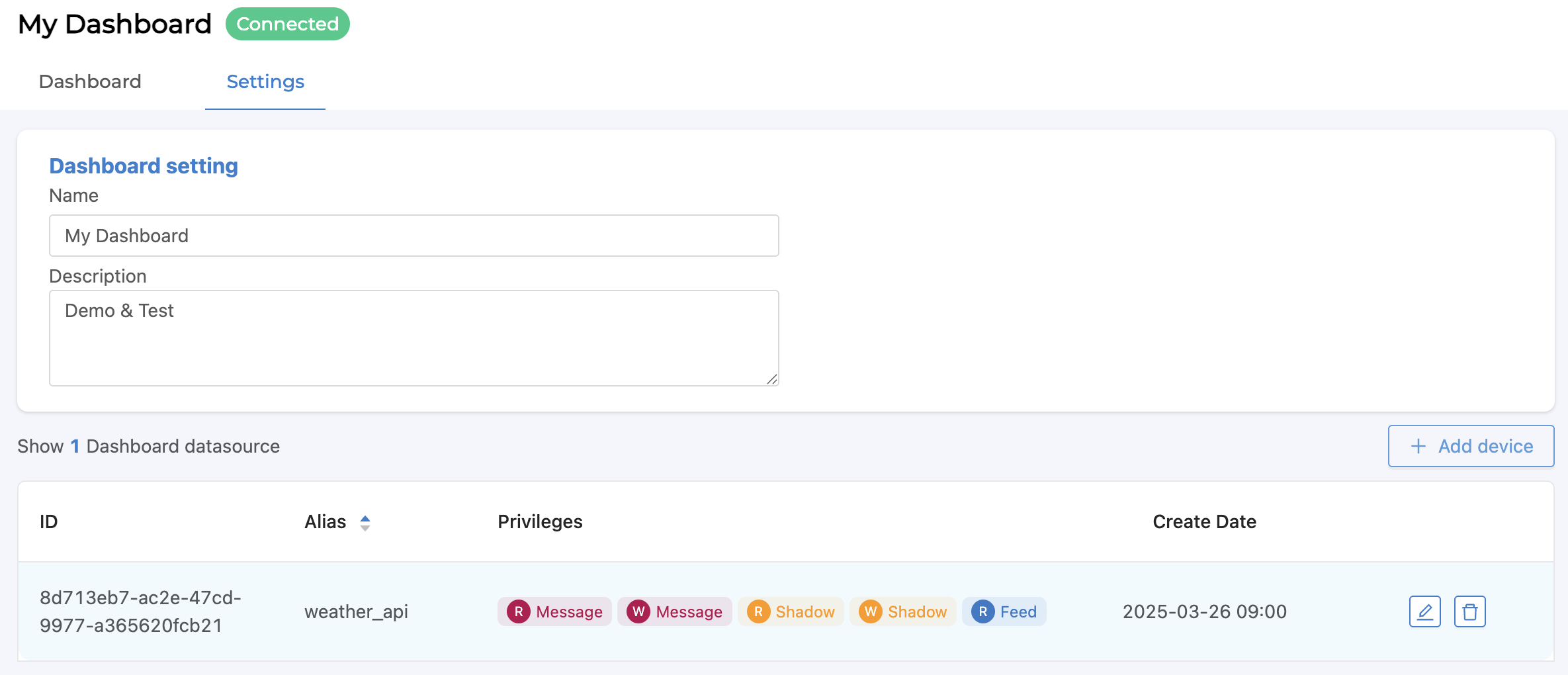
Part 3 Setting tab
This section is used to set and edit the name and details of the Dashboard (Dashboard setting) and set the Device and access rights of that Dashboard as shown in the following figure.
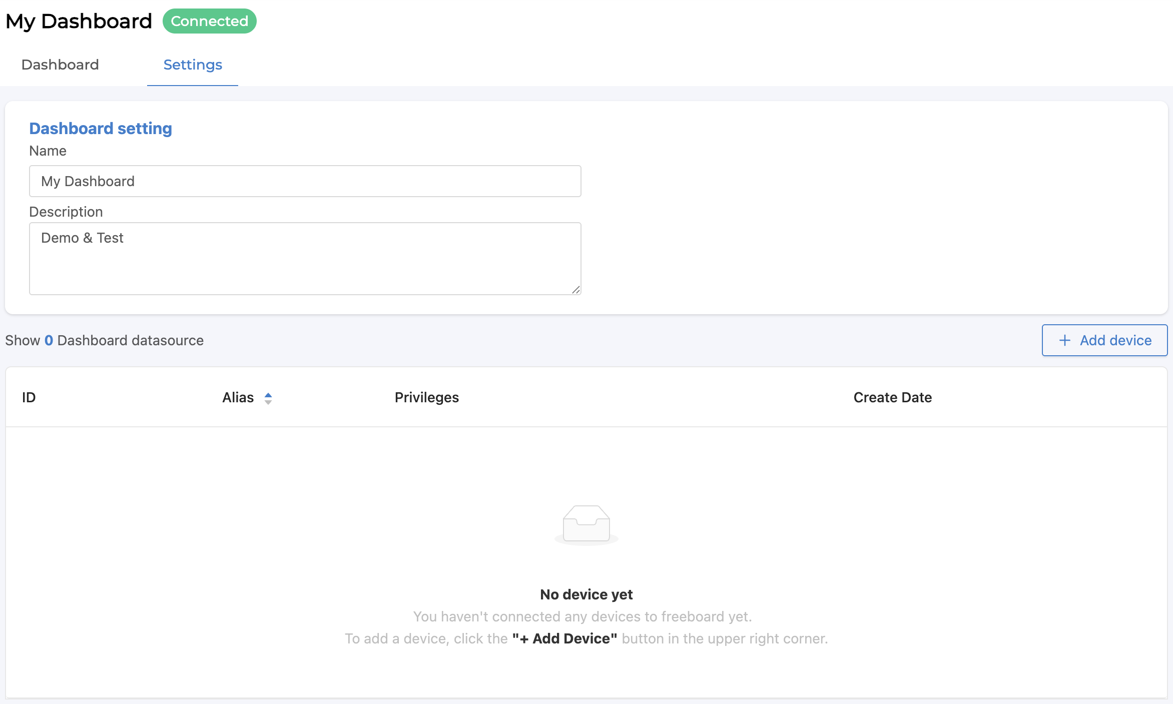
From the above picture, to set the device and access rights, click on the "Add device" button, a form will appear for filling in information as shown in the picture.
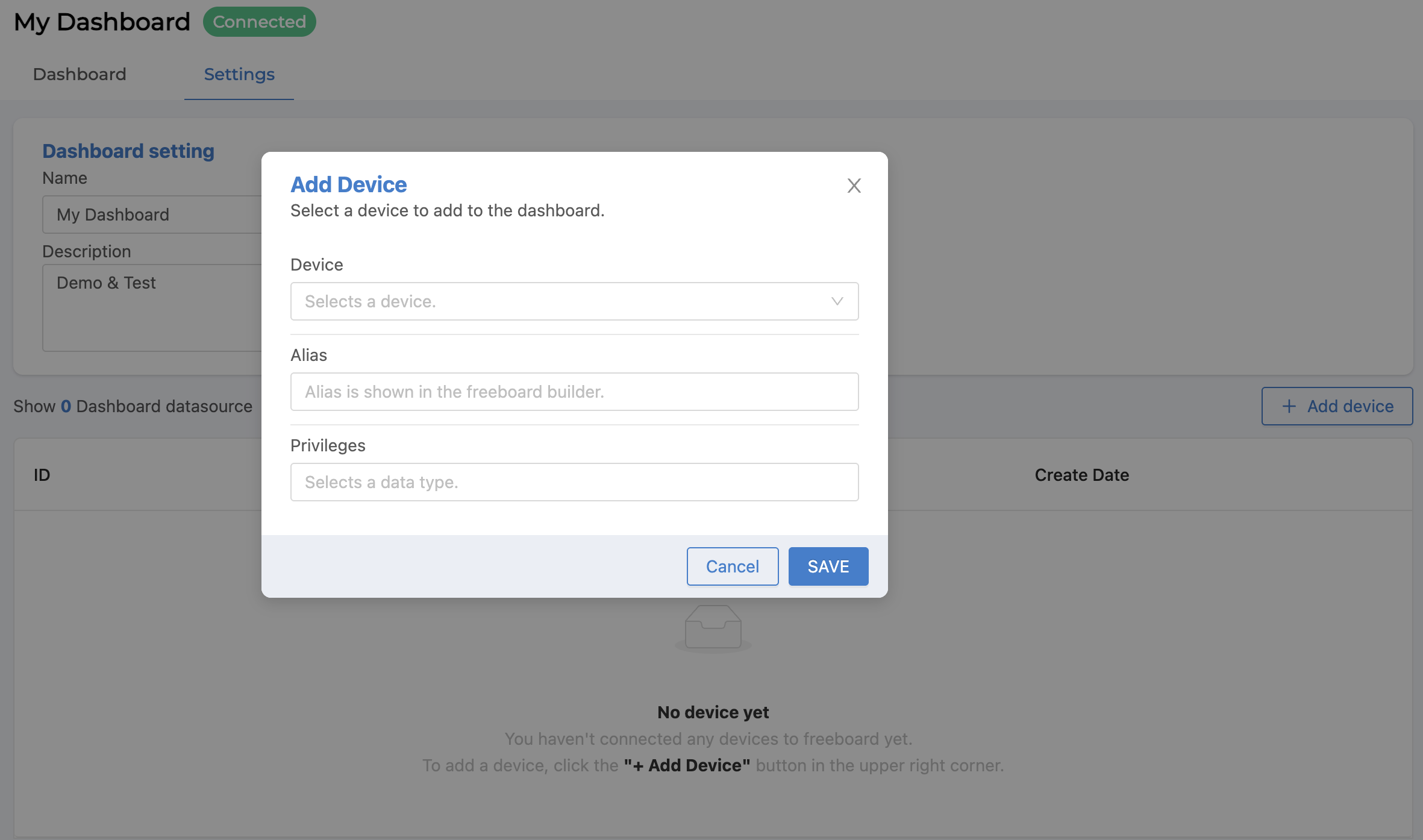
From the image above, the Add device data to the Dashboard that can be specified is as follows:
Device |
List of all devices created under the project. |
Alias |
An alias or label to convey meaning (Default is Device Name) |
Privileges |
There are 6 rights to access the Device: Subscribe Message, Publish Message, Read Shadow, Write Shadow, Read Feed and Write Feed. |
When you have filled in all the information, click on the "SAVE" button, and the list of devices with added privileges will appear as shown in the picture.
Part 4 Edit button
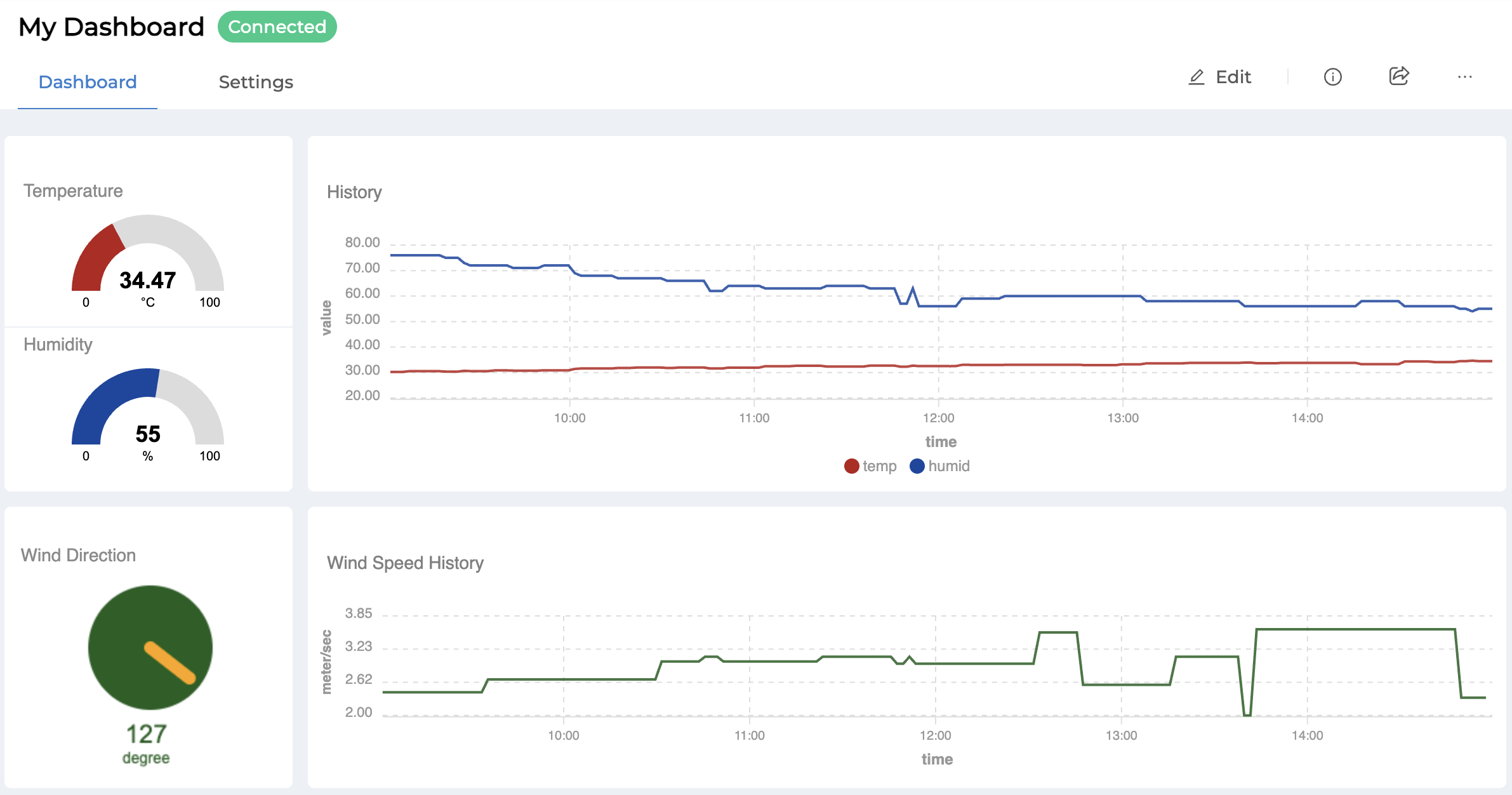
This section will change the Dashboard bar mode (Part 2) from view mode to Dashboard edit mode as shown in the following figure.
From the image above, there is an "Add Panel" button that can be used to add a new panel and within the panel, you can select the widgets to be used within the Dashboard. The "Cancel" button is used to exit the edit mode. If there are any changes to the settings in the Dashboard, the "Save" button will automatically appear so that you can save the changes, as shown in the image.
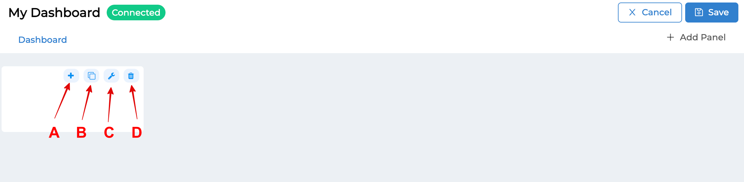
From the image above, a Panel is added. Within the Panel, there are 4 buttons as follows:
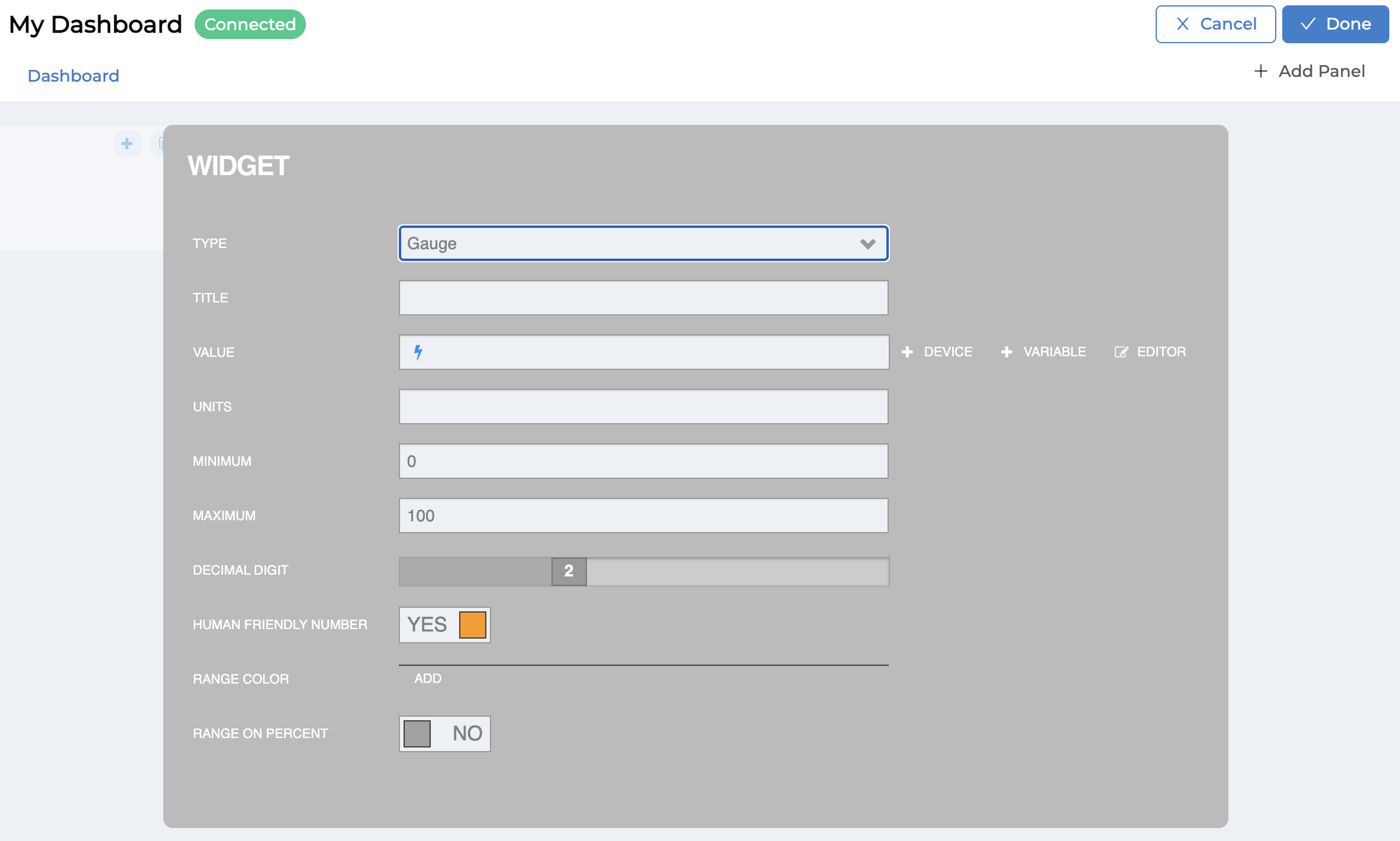
(A) : Add Widget Button is used to add a Widget (Visualization & Controller). There are 8 types of Widgets to choose from: Text, HTML, Indicator Light, Gauge, Button, Toggle, Slider and Chart. The settings for each Widget are different (see more details for each Widget). The following image is an example of the Widget : Gauge settings screen. When you have finished setting, click the "Done" button or if you want to cancel adding the Widget, click the "Cancel" button in the upper right hand corner of the screen.
In addition to the Panel operators, if a Widget is added to the Panel, the Widget section also has operators. When you hover your mouse over each Widget, the various operations will appear, as shown in the figure.
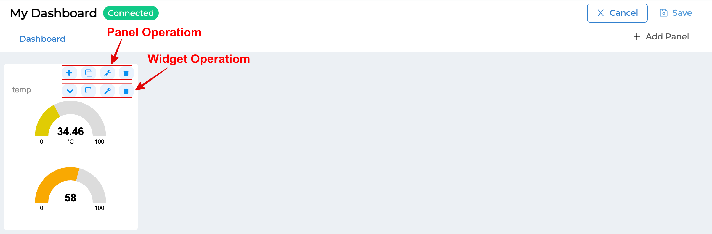
The first button operator of a Widget is used to toggle the order of Widgets in a Panel. This button appears when there is more than one Widget in that Panel.
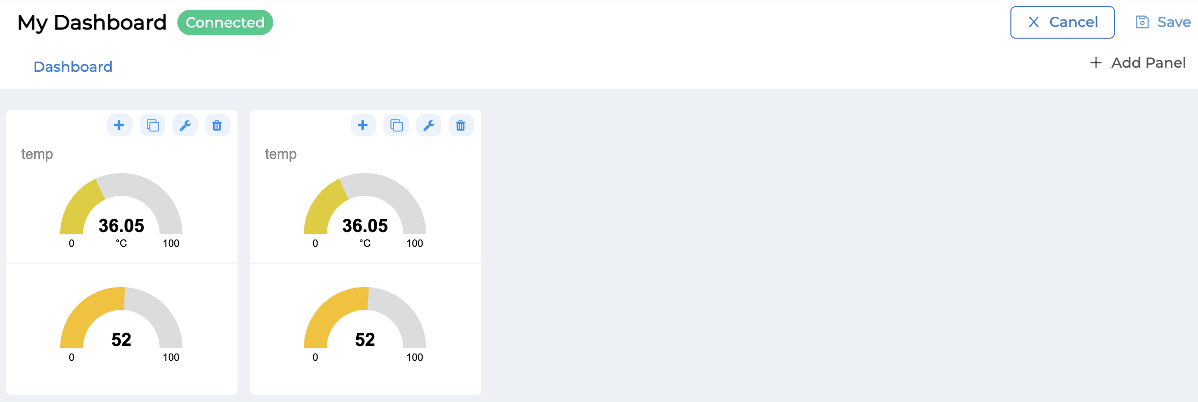
(B) : Duplicate Panel Button is used to create a new Panel, but it is a copy from an already created Panel. The system will copy everything in the Panel to create a new Panel (in the case of a button in Widget Operation, it will be a copy and created as a Widget within the original Panel).
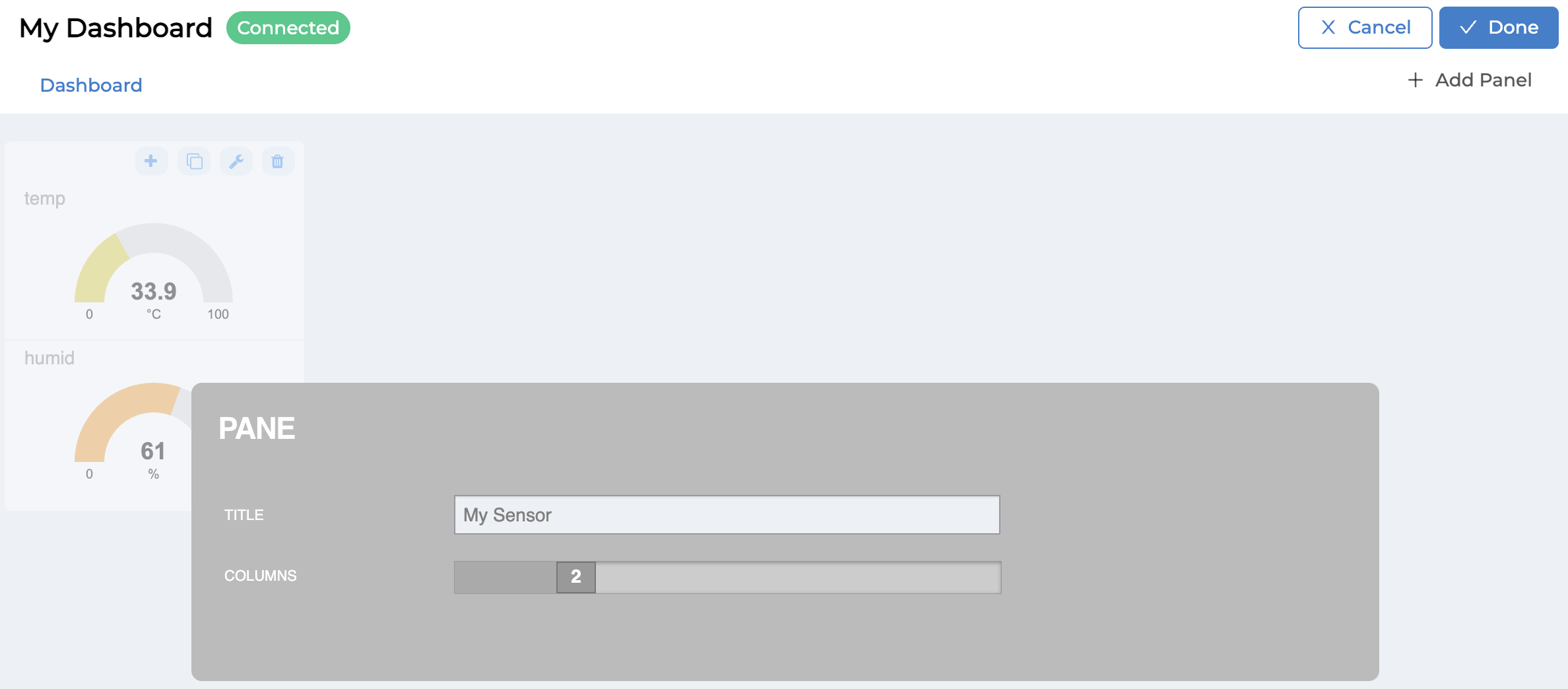
(C) : Setting Panel Button is used to set the name (TITLE) and width (CULUMNS) of the Panel as shown in the figure. When finished setting, click the "Done" button or if you want to cancel the Setting Panel, click the "Cancel" button in the upper right corner of the screen (in the case of the button in Widget Operation, it will be used to edit the settings of that Widget).
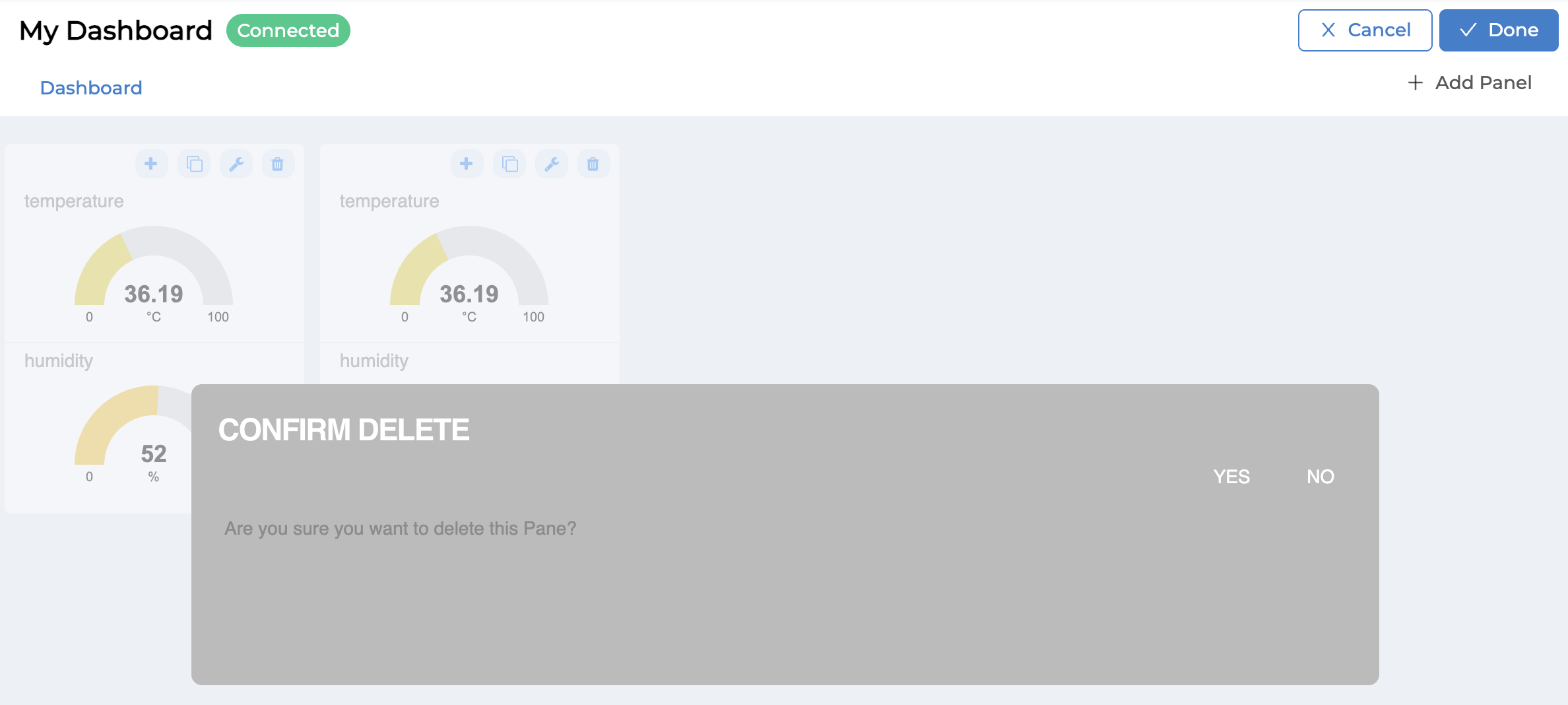
(D) : Delete Panel Button is used to delete the Panel and everything inside that Panel. When you click to delete, the system will ask you to confirm the deletion again (in the case of the Widget Operation button, it will delete only that Widget).
Caution
Precautions for Editing Dashboard
After editing various settings in the Dashboard, before exiting the Dashboard screen every time, check if there is a "Save" button appearing in the upper right-hand corner. If there is, you must press the button to save the changes yourself every time because the system does not save automatically. If you forget to press the "Save" button and exit the screen, all edited information will not be saved in the database. When you enter the Dashboard, you will see the display according to the original settings before editing.
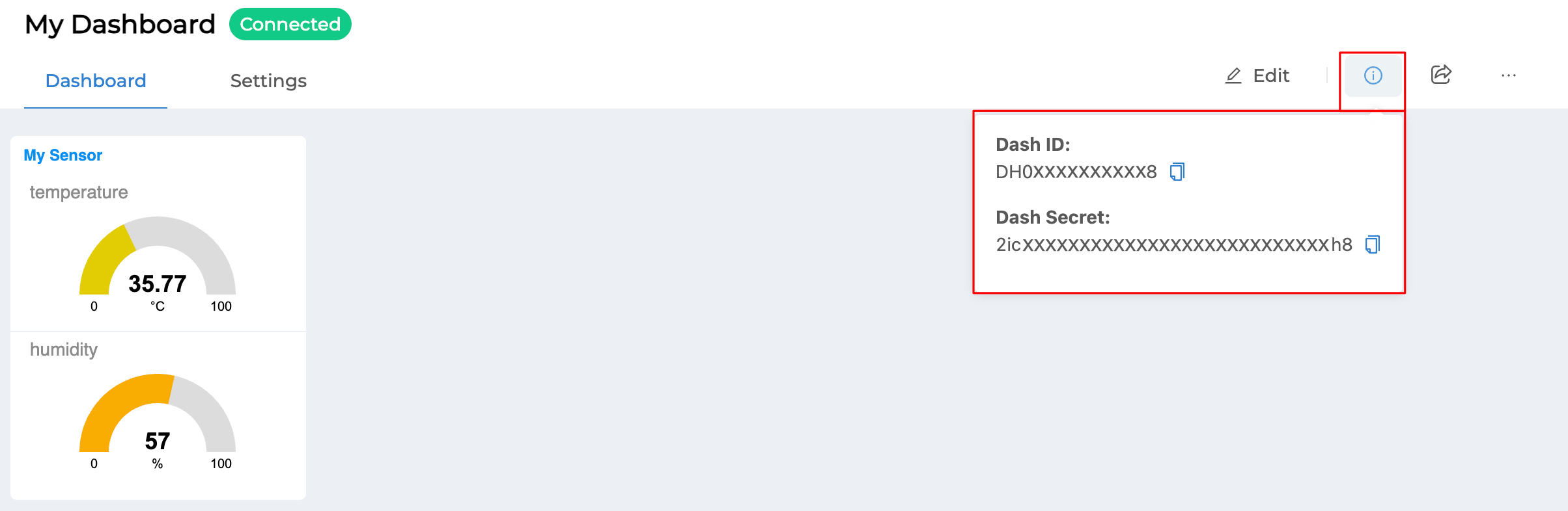
Part 5 Info Button (i)
This section is used to view the Dashboard ID and Secret information, which are the credentials of the Agent that is the intermediary in communicating or exchanging information between the Dashboard and the Platform.
Part 6 Sharing Button
This section is used to share the Dashboard for others to access according to the permissions that have been set. When clicking the Sharing button, a popup will appear for setting up sharing as shown in the following image.
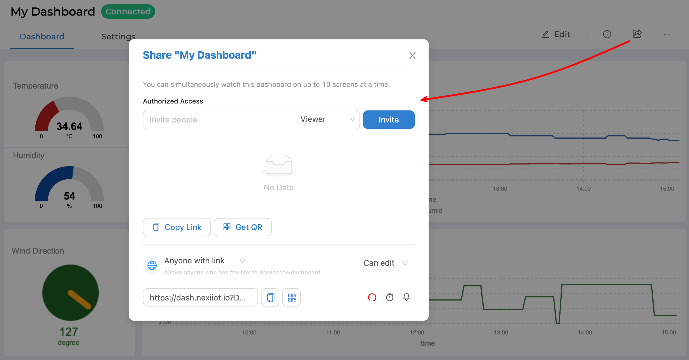
From the image above, sharing can be divided into 2 types:
6.1 Share with specific users
It will be shared to users who already have an account using the Platform. The information that can be specified is as follows:
Authorized Access |
Account or email address registered in the system |
Permission |
"Viewer" means can only view the Dashboard, "Editor" means can view and edit the Dashboard. |
Once you have filled in all the information, click on the "Invite" button, and the list of accounts and permission levels will appear as shown in the picture.
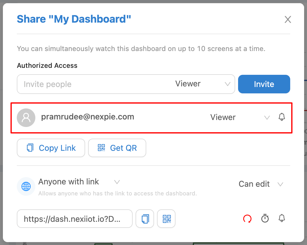
From the image above, the red frame is a list of Accounts that have been granted access to the Dashboard. You can edit the permissions or delete the items by clicking on the dropdown of the permission level list to proceed. As for the bell icon behind the list, it is used to set the on/off notifications (Push Notification) of the Dashboard for each Account.
Once you have set up the accounts you want to grant access to, copy the link (click the "Copy Link" button) or QR Code (click the "Get QR" button) to send to the people who own those accounts to use to access the Dashboard. Users will need to verify their identity with the Platform using the authorized accounts before they can access the Dashboard.
6.2 Shared with anyone who has the link
It can be shared with anyone without any identity verification. All you need is the URL that the system creates to access the Dashboard. You can access the Dashboard according to the permissions set in the link, which will be at the bottom of the sharing popup (red frame) as shown in the picture.
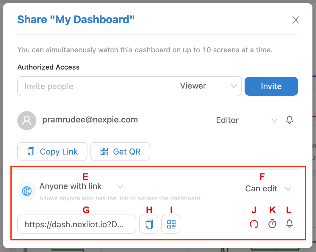
From the picture above, each component has the following details:
(E) : Select the type of sharing. This section is a dropdown that allows you to select the types of sharing that can be done. If you select "Anyone with link", you can share with anyone who has the link and can access it (6.2). If you select "Only Specific users", you can only share with specific users (6.1).
(F) : Select permission level. This section is a dropdown for setting permission to access the Dashboard of the shared link. If you select "Can view", you will only be able to view the Dashboard. If you select "Can edit", you will be able to view and edit the Dashboard.
(G) : URL for accessing the Dashboard. This section displays a system-generated link that must be sent to those who wish to access the Dashboard. Anyone who knows the link will be able to access the Dashboard with their assigned permissions without needing to verify their identity.
(H) : Copy public link to clipboard button This section facilitates copying the link for sharing the Dashboard. When this button is clicked, the link in (G) will be automatically copied.
(I) : Show public QR code button This section is used to create a QR Code for sharing the Dashboard. When you click on this button, the system will display a QR Code for scanning into the Dashboard.
(J) : Regenerate link button This will be used to generate a new link for sharing the Dashboard and will cause the original link to become invalid.
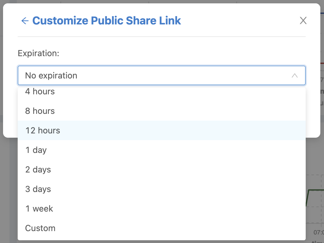
(K) : Set expiration time for pubilc link button This section is used to set the expiration time of the shared link for how long it can be used. When you click this button, the system will display a screen to set the expiration time of the link as shown in the picture. When you have selected the expiration time, click the "Apply" button (if you do not set the default value, it will never expire).
(L) : Enable push notifiication button This section is used to set the Dashboard notification (Push Notifiication) on/off (same as the bell icon in 6.1).
Note
Dashboard sharing settings you should know
The two types of sharing URL generated by the system are not the same, and each sharing type has only one type and one usable link.
User-Specified Sharing (6.1) To revoke or change sharing permissions, perform the following actions for each account individually by deleting the item or editing the permissions, respectively.
Sharing that is accessible to everyone with the link (6.2) To revoke sharing permissions, change the Share Type dropdown (E) to "Only Specific users" and the sharing link will become inactive. However, if set back to "Anyone with link", the original link, if it has not expired, will become active again. However, if you do not want the original link to be active anymore, create a new link by clicking the Regenerate link button (J).
Anyone with access to the link can share the link (6.2) Changing permissions or lifetime settings does not change the URL, but the system will check the new settings directly from the database.
Part 7 Other Button
The part that is the 3 dots icon, when clicked, the system will display a sub-menu for performing actions with the Dashboard as follows:
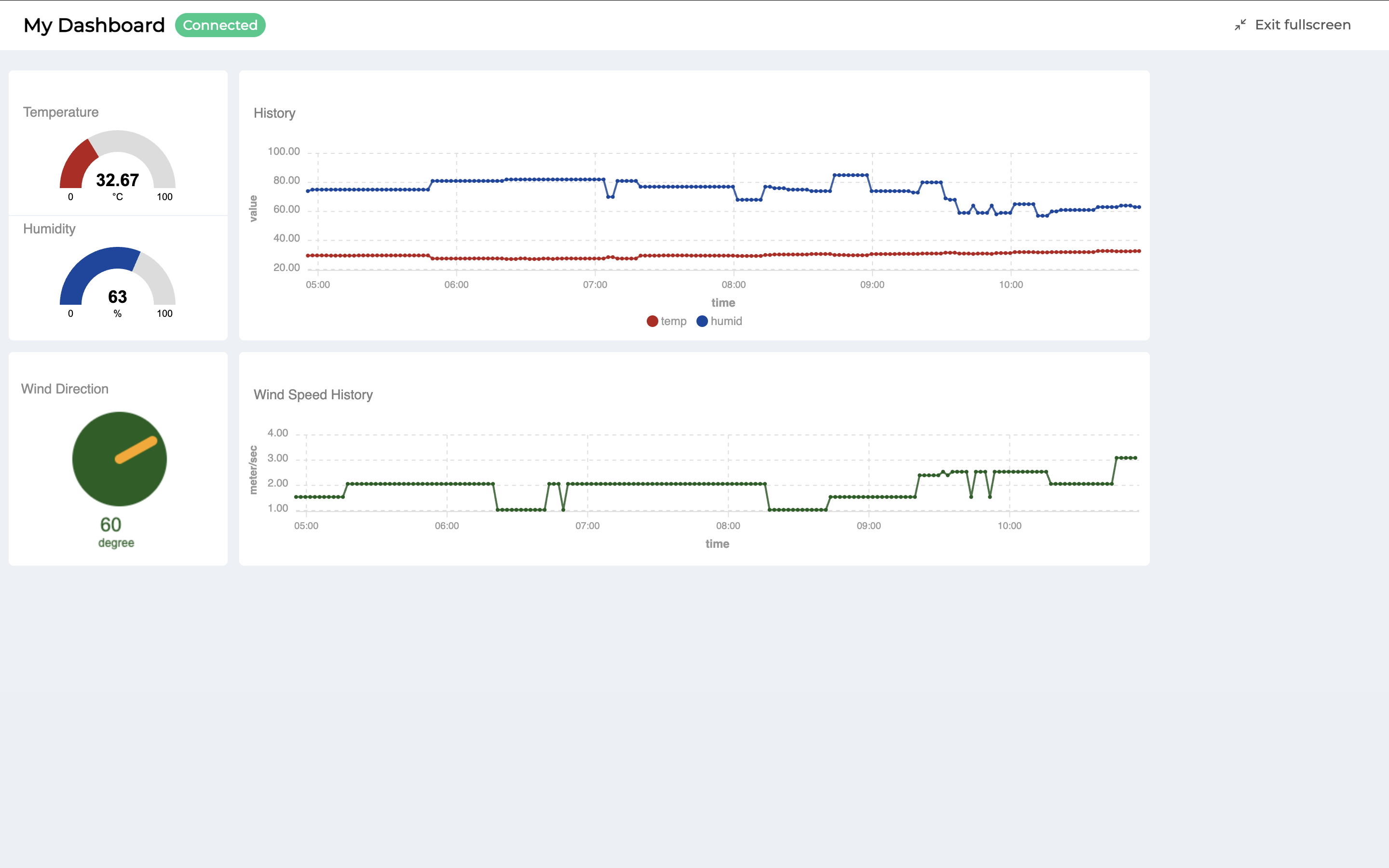
Enter fullscreen is used to expand the screen to view the Dashboard in full screen mode as shown in the figure.
Import is used to import the Dashboard settings script, which is a JSON file that can be backed up and stored for login.
Export is used to export the Dashboard settings script which is in JSON File format for backup or you may want to keep it as a template and use it by importing it in the previous list.
Reset is used to delete all Dashboards (Panels and Widgets). When clicked, the system will pop up to confirm the action. If confirmed, click the "OK" button. The system will clear all Dashboards. After that, you can create a new Dashboard or if you want to exit the Dashboard settings screen, click the "Save" button to save.
Widget Settings
Widgets are small programs of the Dashboard that are prepared for users to select as elements in setting up the display or control via the Dashboard. Each Widget has different usage and settings. They can be divided into 2 main groups:
Monitoring Widget means a Widget that is used for displaying data (Data Visualization) or reading data values from the Datasource in the Platform only, not including Text, HTML, Indicator Light, Gauge, Chart.
Controller Widget means a Widget that can command or write data values back to the Datasource in the Platform to control or command other devices that are waiting for commands, such as HTML, Button, Toggle, Slider.
Referencing values or calling functions to read or write data through the Platform. The reference format will be referring through the Device, which will be a Datasource from the Platform. Setting values in the Widget has an easy way to observe which fields can fill in Configuration to refer to values or call functions from the Platform's Datasource. There will be a "lightning bolt" symbol or a "+ Device" button behind that field, as shown in the picture below. Just click on the "+ Device" button or type "#" and the system will automatically display a list to choose from (Auto Complete) without having to type everything yourself.

The settings in Widget to read data values or call various functions from the Datasource in the Platform are as follows:
- #["...Device Name..."]["status"]
Used to read the connection status of the Platform of the Device. The value obtained will be 0 or 1 (0 = not connected, 1 = connected).
- #["...Device Name..."]["shadow"]["... Object Key 1 ...."] ... ["... Object Key n ...."]
Used to read the Shadow value of the Device. The reference will be a layered reference according to the Shadow JSON structure.
- #["...Device Name..."]["feed"]
It is used to read Feed (Timeseries Database) values, which is suitable for use with "Chart" Widget.
- #["...Device Name..."]["msg"]["... Topic Path 1..."] ... ["... Topic Path n..."]
Used to read values obtained from subscribing to topics that the dashboard itself has already subscribed to. The system will also retrieve Topic Path data for automatic selection (Auto Complete) if the device has already subscribed to the topic. However, if you want to set it in the Widget first, the format for setting the topic in the Widget, if the topic is subscribed via MQTT, is to
@msg/home/bedroom/lightset the value in the Widget to subscribe to the topic as follows:#["...Device Name..."]["msg"]["home"]["bedroom"]["light"]
- #["...Device Name..."]["id"]
Used to read the Device ID value of device.
- #["...Device Name..."].writeShadow("...Key...", "...Value...")
It is a function call to write values or update values to the Shadow of that Device. The parameters that must be specified in the function have 2 values: Key, which means the field in the Shadow that you want to write the value to, and Value, the value that you want to write or update in the case of the field in the Shadow that you want to write data. Sending 2 Parameters as Strings can only be used in the case of updating Shadows that have a single-level JSON structure. If it is an update of a field that is nested in multiple layers, you must send only one Parameter as JSON to update it.
example
{
    "A": 1,
    "B": {
        "b1": 2,
        "b2": "Y"
    }
}
The above JSON is an example of the Shadow structure that needs to be updated.
If you want to update "A", write the command as follows:
#["...Device Name..."].writeShadow("A", 2)If you want to update "b2", write the command as follows:
#["...Device Name..."].writeShadow({"B":{"b2":"N"}})
- #["...Device Name..."].publishMsg("...Topic...","...Message...")
It is a function call to publish a message to the desired topic. There is no need to specify a topic,
@msglike publishing directly to the MQTT Broker, such as:#["...Device Name..."].publishMsg("send/to/my/topic", "hello")
- #["...Device Name..."].privateMsg("...Topic...","...Message...")
It is a function call to publish a message to yourself only. To receive a message, you must subscribe to the
@private/...Topic...published topic or subscribe to the topic@private/#. This function cannot subscribe to the Dashboard. For example:#["...Device Name..."].privateMsg("send/data/to/my", "hello")If you want to receive information, subscribe to the topic
@private/#or@private/send/data/to/my
Widget : Text
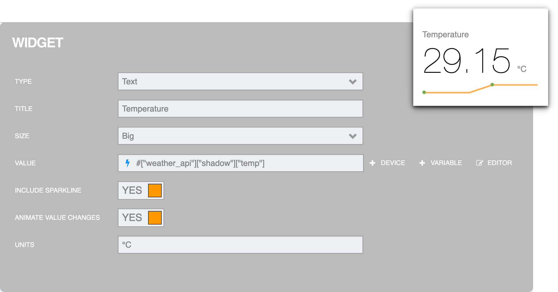
It is a Monitoring Widget type Widget used to display in plain text format. The settings screen is as follows:
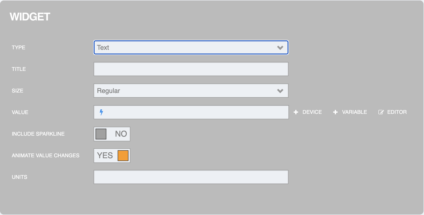
It is a Monitoring Widget type Widget used to display in plain text format. The settings screen is as follows:
TYPE is the type of Widget (select Text).
TITLE is the widget title or field name.
SIZE is the font size. There are 2 sizes to choose from: Regular and Big.
VALUE is the value to be displayed, which is the part that can read data values from the Datasource in the Platform, such as:
#["device_name"]["shadow"]["temp"]INCLUDE SPARKLINE is to display a graph line from the values VALUE, where the values are displayed as numbers (YES to display a graph, NO to not display a graph).
ANIMATE VALUE CHANGES is to create animations to show the change of values (YES animates, NO does not animate).
UNITS is a unit of measurement of data.
Once you have filled in the Widget settings, click the "Done" button in the upper right corner. An example of the settings and the result is as shown in the following figure.
Widget : HTML
It is a Widget that can be set to be a Monitoring Widget or Controller Widget because you can write the code in HTML or Javascript like creating an HTML web page. The settings screen looks like this:
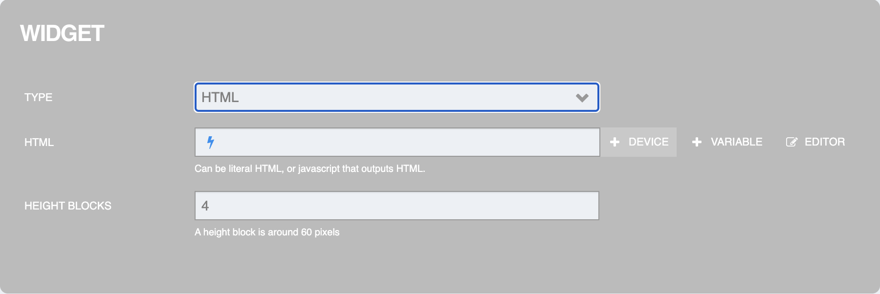
From the figure above, the information that can be specified for setting is as follows:
TYPE is the type of Widget (select HTML).
HTML is a HTML or Javascript code writing field to display the results, which can refer to reading data values or calling various functions from the Datasource in the Platform. The reference format is as follows:
${#["device_name"]["shadow"]["temp"]}Height Blocks is the height of the display area.
Once you have filled in the Widget settings, click the "Done" button in the upper right corner. An example of the settings and the result is as shown in the following figure.
Example 1 : Display the values from Shadow
<!DOCTYPE html>
<html>
<body>
Wind Direction
<canvas id="myCanvas" width="300" height="300">
Sorry, your browser does not support canvas.
</canvas>

<script>
let angle = ${#["weather_api"]["shadow"]["wind"]["deg"]}; // Read Shadow
const canvas = document.getElementById("myCanvas");
const ctx = canvas.getContext("2d");

ctx.globalCompositeOperation = "source-over";

ctx.arc(110,65,49,0,2*Math.PI);
ctx.fillStyle = "#1B5E20";
ctx.fill();

ctx.font = "20px Arial";
ctx.fillStyle = "#1B5E20";
ctx.fillText(angle,90,140);

ctx.font = "12px Arial";
ctx.fillStyle = "#1B5E20";
ctx.fillText("degree",88,156);

angle = (angle + 1) % 360;

ctx.translate(110,65); // First translate the context to the center you wish to rotate around.
ctx.rotate(angle*Math.PI/180 ); // Then do the actual rotation.
ctx.translate(-110,-65)

ctx.beginPath();
ctx.lineWidth=10;
ctx.lineCap='round';
ctx.moveTo(110,65);
ctx.lineTo(110,26);
ctx.strokeStyle = "orange";
ctx.stroke();
</script>
</body>
</html>
Example 2: Updating values back to Shadow
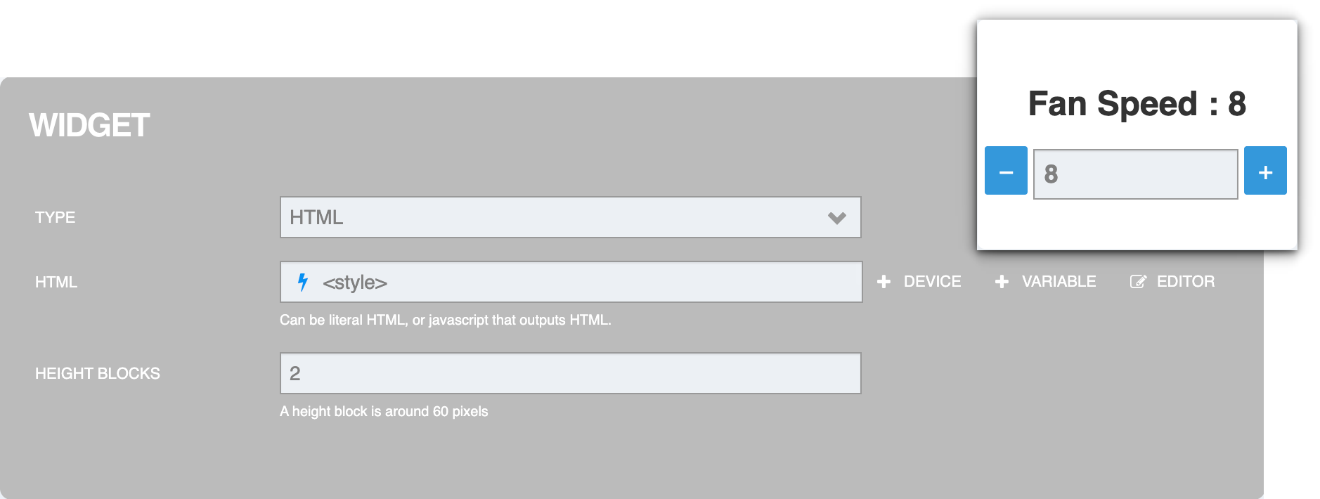
<style>
    #output {
        font-size: 24px;
        margin-bottom: 10px;
        color: #333;
        text-align:center;
    }
    #minus, #plus {
        font-size: 18px;
        margin: auto;
        cursor: pointer;
        padding: 7px 10px;
        background-color: #3498db;
        color: #fff;
        border: none;
        border-radius: 2px;
    }

    #minus:hover, #plus:hover {
        background-color: #2980b9;
    }

    #input {
        font-size: 18px;
        padding: 7px;
        font-weight: bold;
    }
    </style>

    <h1 id="output">Fan Speed : ${#["fan"]["shadow"]["speed"]}</h1>
    <button id="minus">−</button>
    <input type="text" inputmode="numeric" style="width:60%" id="input" />
    <button id="plus">+</button>

    <script>
    const minusButton = document.getElementById('minus');
    const plusButton = document.getElementById('plus');
    const inputField = document.getElementById('input');
    const outputField = document.getElementById('output');

    function updateData() {
        outputField.textContent = "Value: " + currentValue;
        #["fan"].writeShadow("speed", currentValue); //Write Shadow
    }
    let currentValue = ${#["fan"]["shadow"]["speed"]};
    inputField.value = currentValue;

    minusButton.addEventListener('click', event => {
        event.preventDefault();
        currentValue -= 1;
        inputField.value = currentValue;
        updateData();
    });

    plusButton.addEventListener('click', event => {
        event.preventDefault();
        currentValue += 1;
        inputField.value = currentValue;
        updateData();
    });
    </script>
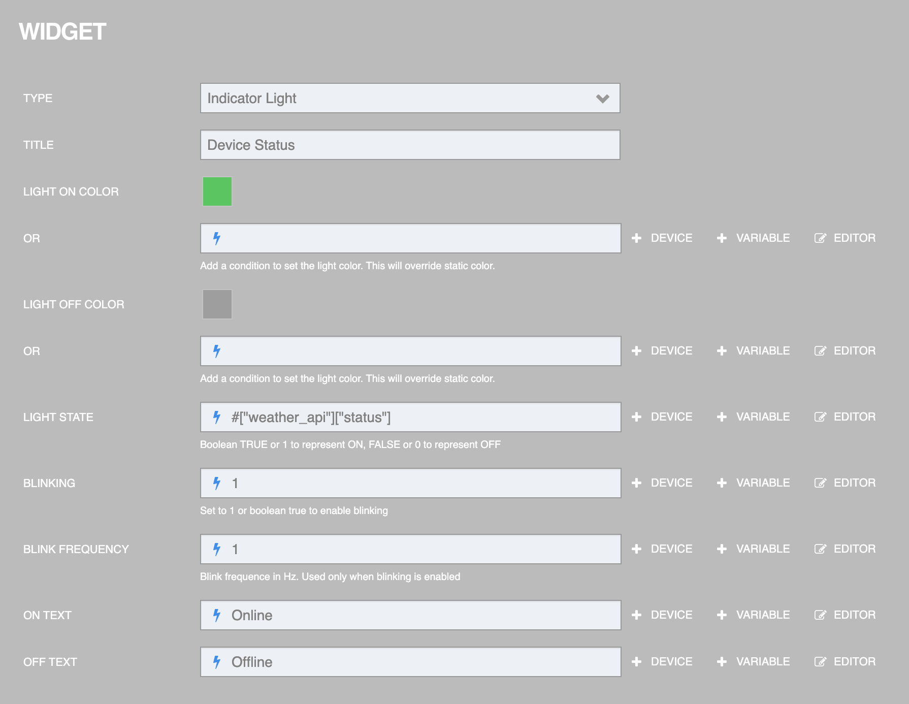
Widget : Indicator Light
It is a Monitoring Widget type Widget used to display the status in 2 possible states, such as ON/OFF, Online/Offline, etc. The settings screen is as follows:
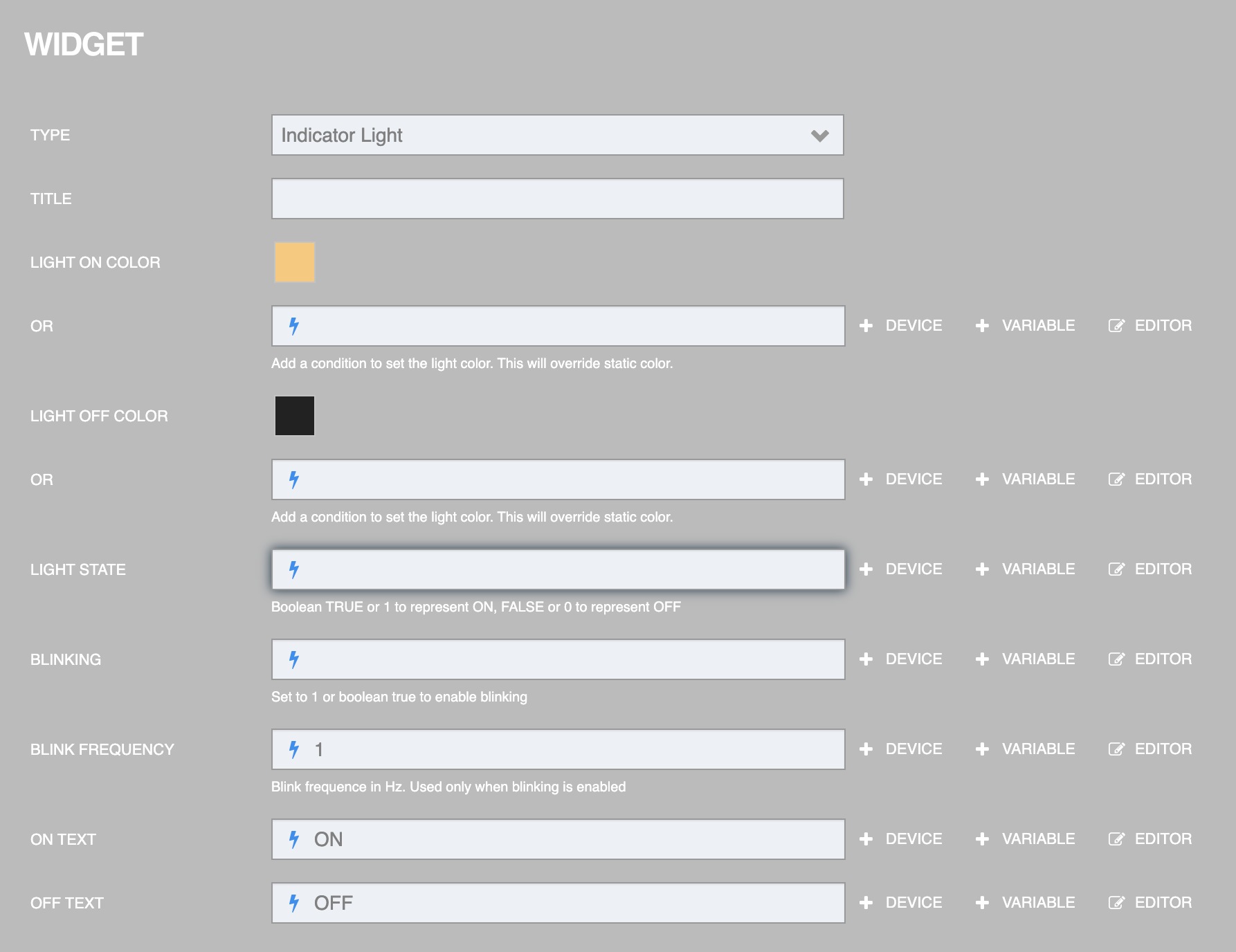
From the figure above, the information that can be specified for setting is as follows:
TYPE is the type of Widget (select Indicator Light).
TITLE is the widget title or field name.
LIGHT ON COLOR is the color you want to display when the status is ON or if you want the color value read from the Datasource, specify it in the "OR" box below.
LIGHT OFF COLOR is the color you want to display when the status is OFF or if you want the color value read from the Datasource, specify it in the "OR" box below.
LIGHT STATE is to receive the status that will change. The ON state sends a value of
TUREor 1, the OFF state sends a value ofFALSEor 0.BLINKING is the blinking of the light (
TUREor 1 to turn on the blinking of the light).BLINK FREQUENCY is the blinking frequency of the light, in Hertz (Hz).
ON TEXT is the text to display when the status is
TUREor 1 (can retrieve the value from the Datasource or enter the value directly).OFF TEXT is the text to display when the status is
FALSEor 0 (can retrieve the value from the Datasource or enter the value directly)
Once you have filled in the Widget settings, click the "Done" button in the upper right corner. An example of the settings and the result is as shown in the following figure.
The results are as follows:
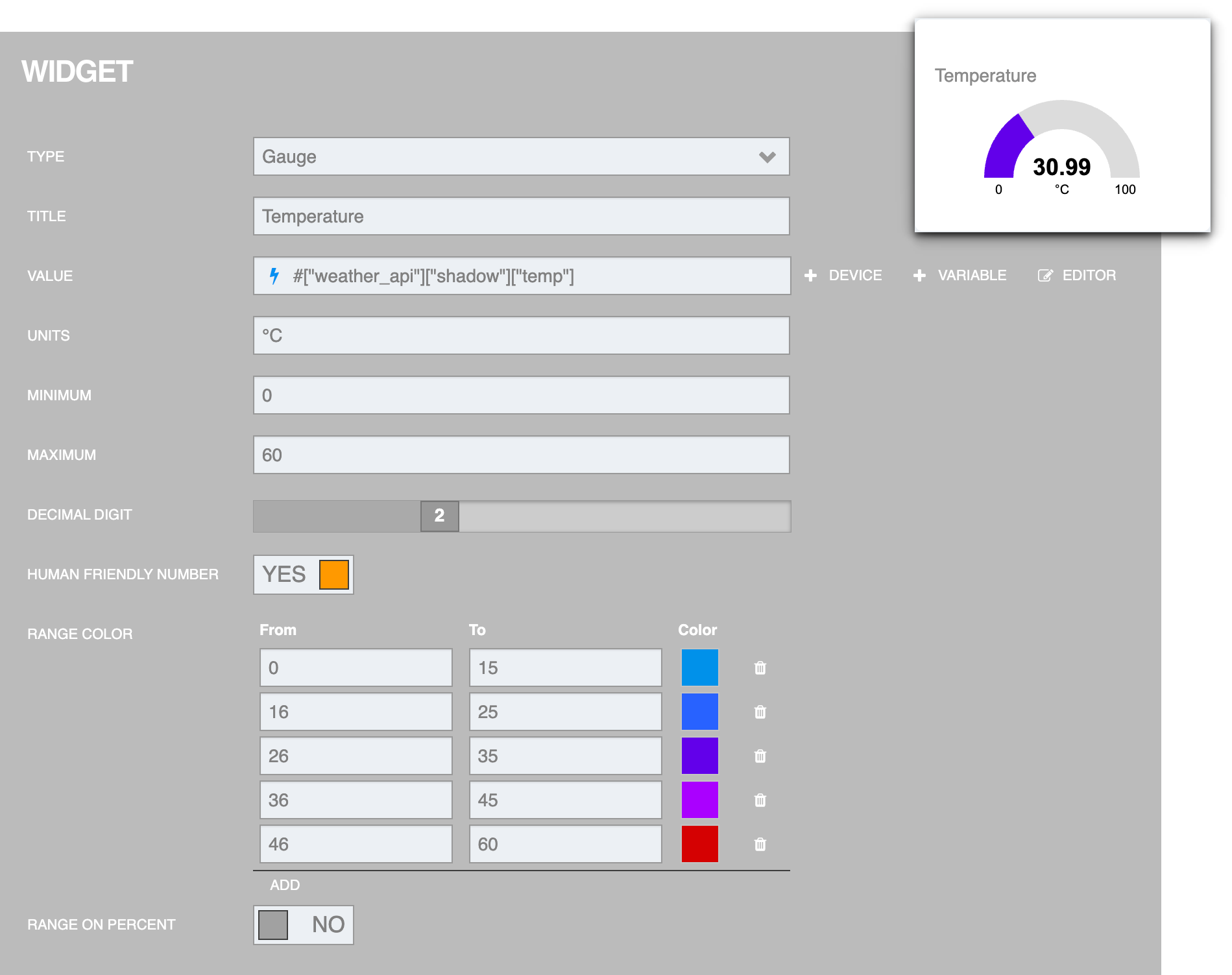
Widget : Gauge
It is a Monitoring Widget type widget used to display results in measurement format. Maximum/minimum values can be set. The settings screen is as follows:
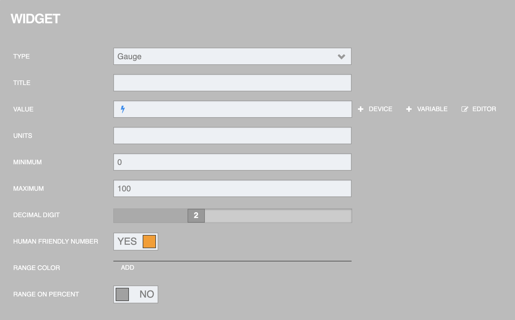
From the figure above, the information that can be specified for setting is as follows:
TYPE is the type of Widget (select Gauge).
TITLE is the widget title or field name.
VALUE is the data value to be displayed (can be retrieved from Datasource or entered directly)
UNITS is a unit of measurement of data.
MINIMUM is the lowest value that can be displayed (a number).
MAXIMUM is the maximum value that can be displayed (a number).
DECIMAL DIGIT is the number of decimal places.
HUMAN FRIENDLY NUMBER is a conversion of numeric data in decimal format to integer format with various units of measurement, such as converting 1,000 to 1K, converting 1,000,000 to 1M, etc.
RANGE COLOR is a color display format based on the range of numeric values, using different colors to represent the differences in that range of values (press the word ADD to specify the color and range of data values).
RANGE ON PERCENT is a display of numerical values within a specified percentage range.
Once you have filled in the Widget settings, click the "Done" button in the upper right corner. An example of the settings and the result is as shown in the following figure.
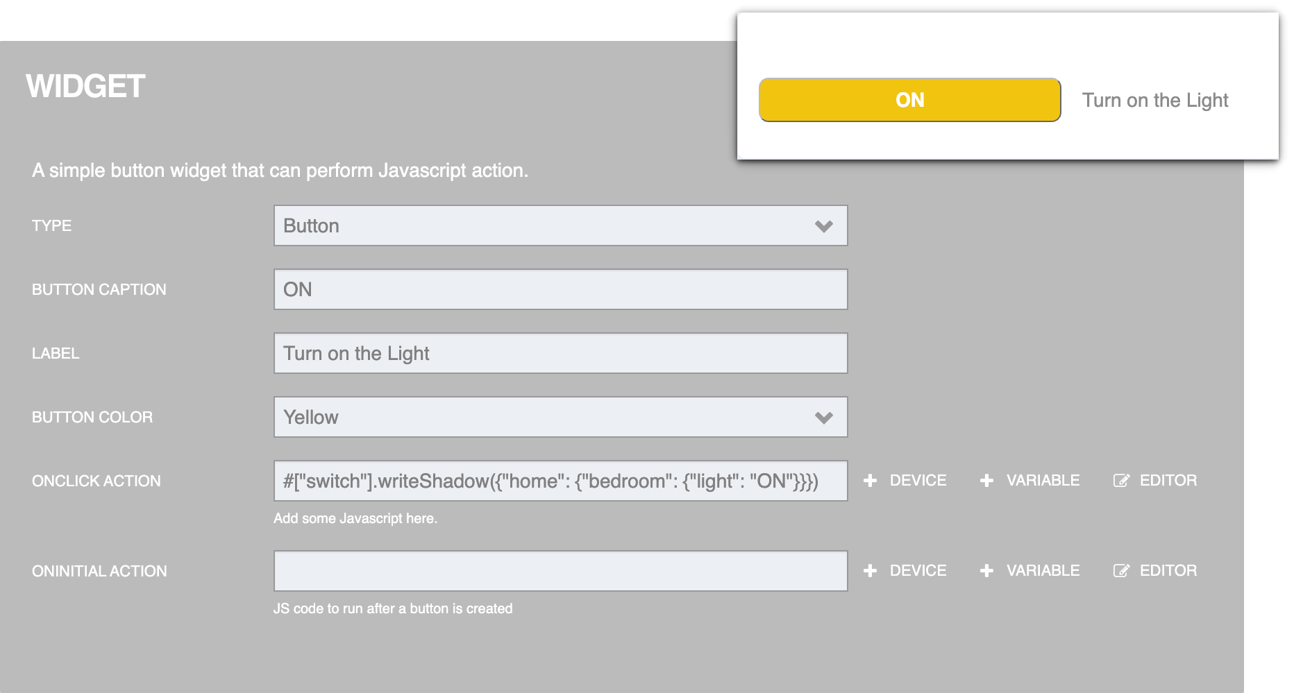
Widget : Button
It is a Controller Widget type Widget used to create a button on the Dashboard and when pressed, it will perform certain actions as set. The settings screen looks like this:
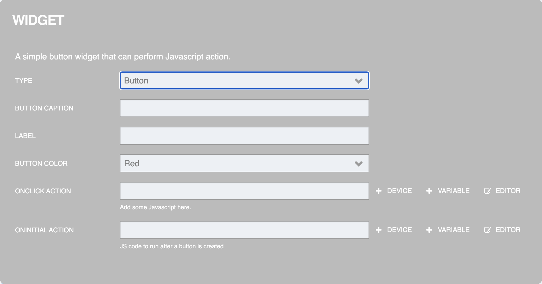
From the figure above, the information that can be specified for setting is as follows:
TYPE is the type of Widget (select Button).
BUTTON CAPTION is the text displayed on the button.
LABEL is a label/description.
BUTTON COLOR is to set the color of the button.
ONCLICK ACTION is the action that occurs when the button is pressed.
ONINITIAL ACTION is the first action that occurs when the button is created.
Once you have filled in the Widget settings, click the "Done" button in the upper right corner. An example of the settings and the result is as shown in the following figure.
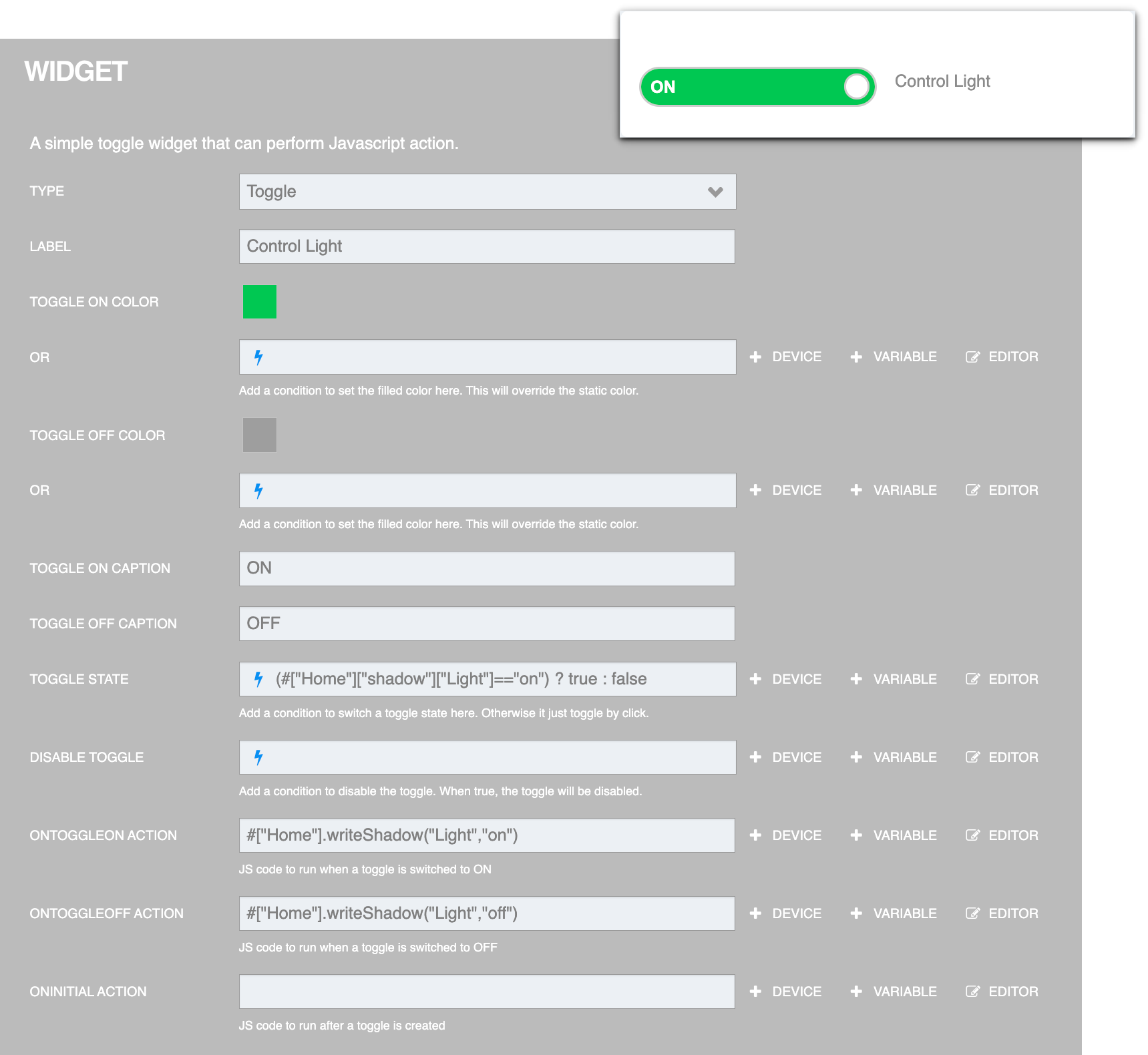
Widget : Toggle
It is a Controller Widget type Widget used to create a 2-state button that alternates back and forth (similar to a light on/off switch). The settings screen looks like this:
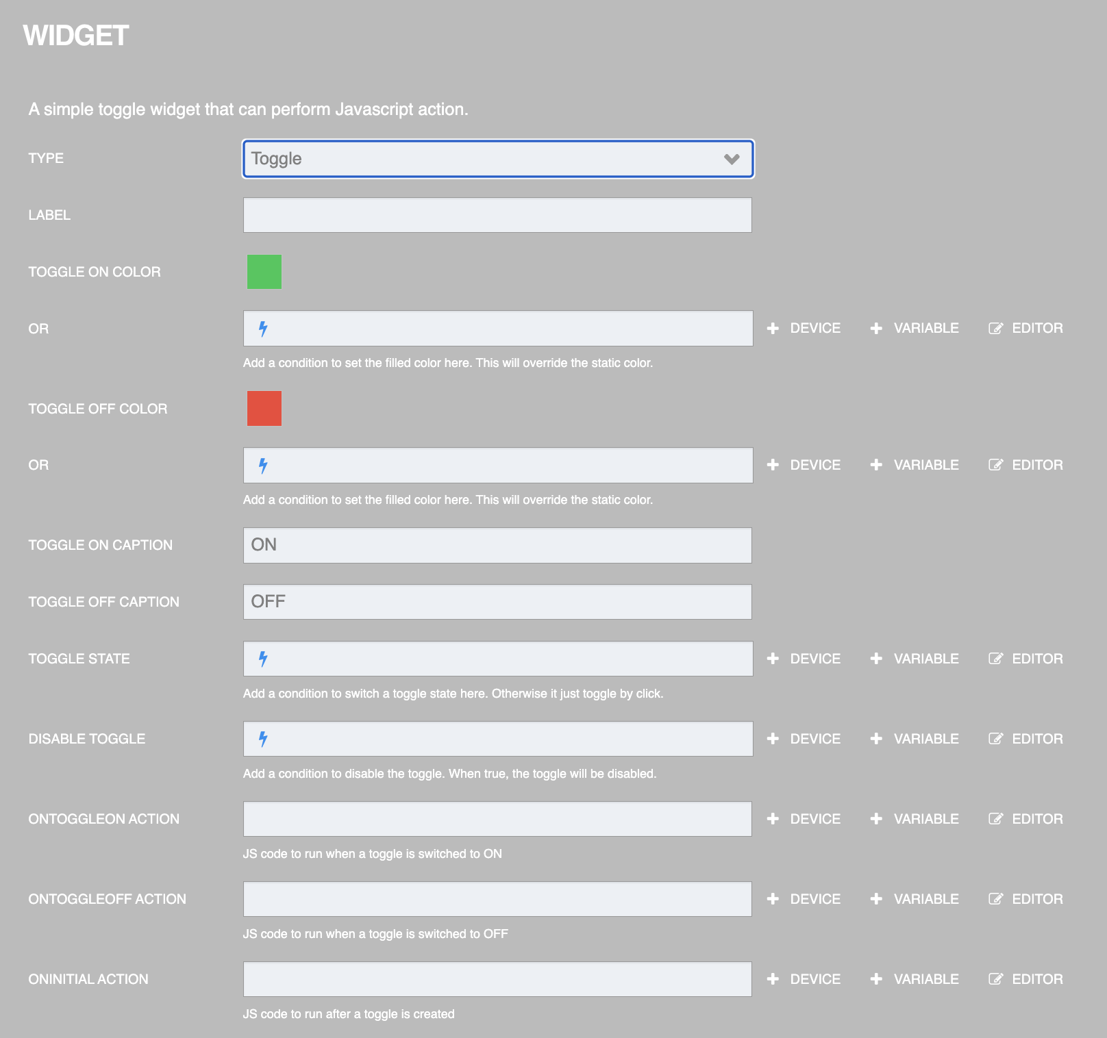
From the figure above, the information that can be specified for setting is as follows:
TYPE is the type of Widget (select Toggle).
LABEL is a label/description.
TOGGLE ON COLOR is the color you want to display when the status is ON or if you want the color value read from the Datasource, specify it in the "OR" box below.
TOGGLE OFF COLOR is the color you want to display when the state is OFF or if you want the color value read from the Datasource, specify it in the "OR" box below.
TOGGLE ON CAPTION is the text to display when the status is TUREor 1 (can be retrieved from the datasource or entered directly).
TOGGLE OFF CAPTION is the text to display when the status is FALSEor 0 (can be retrieved from the datasource or entered directly).
TOGGLE STATE is to receive the changed state (synchronize with the value in Platform), where ON state sends a value of
TUREor 1, OFF state sends a value ofFALSEor 0.DISABLE TOGGLE is a condition to use to disable the toggle. When the value is
TUREor 1, the toggle is disabled.ONTOGGLEON ACTION is the action that occurs when the state changes from OFF to ON.
ONTOGGLEOFF ACTION is the action that occurs when the state changes from ON to OFF.
ONINITIAL ACTION is the first action that occurs when the Toggle is created.
Once you have filled in the Widget settings, click the "Done" button in the upper right corner. An example of the settings and the result is as shown in the following figure.
Widget : Slider
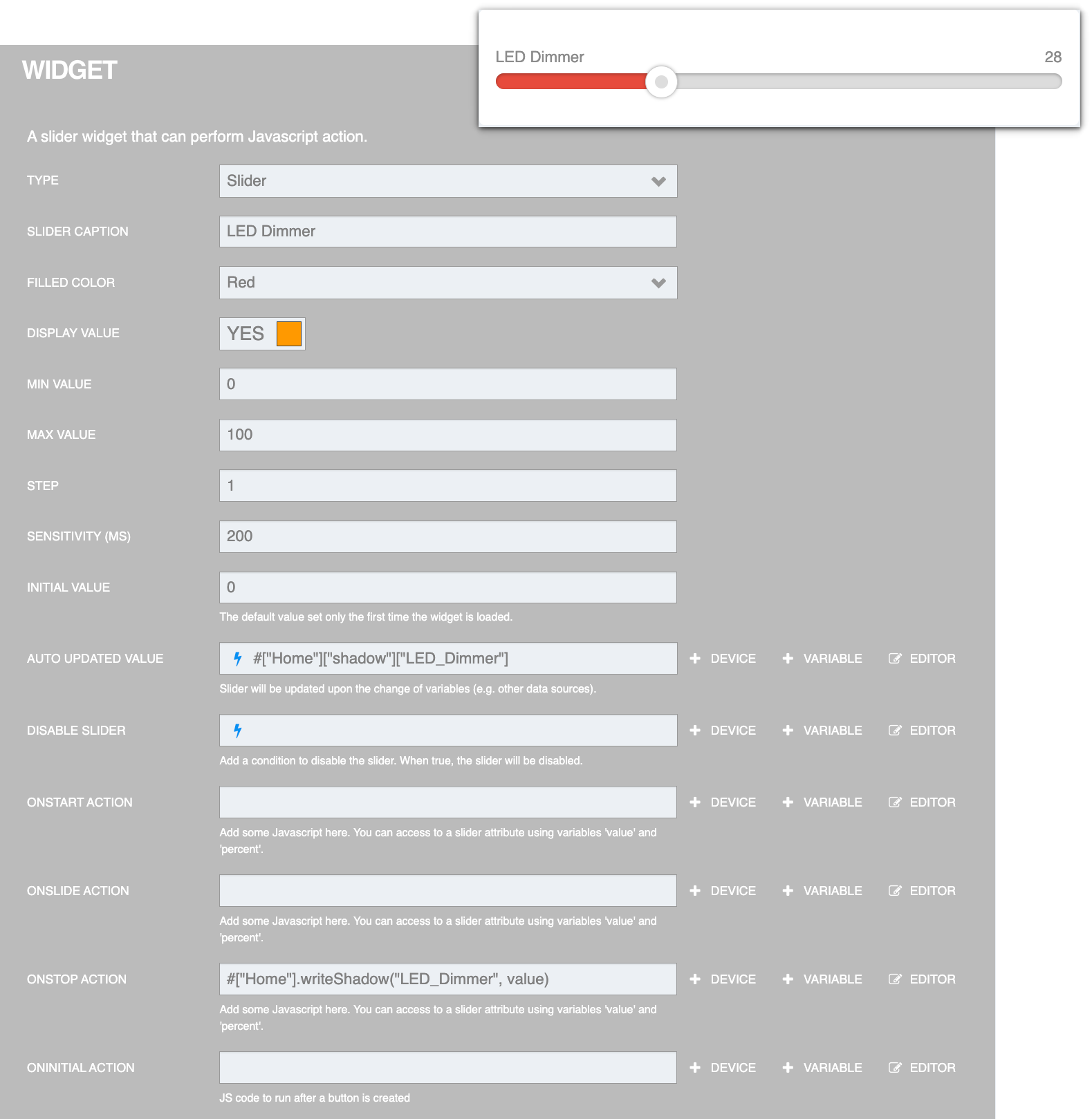
It is a Controller Widget type Widget used to create Slid Bar to set control values such as controlling the speed of the motor, setting the brightness level of the light bulb, etc. The settings screen is as follows:
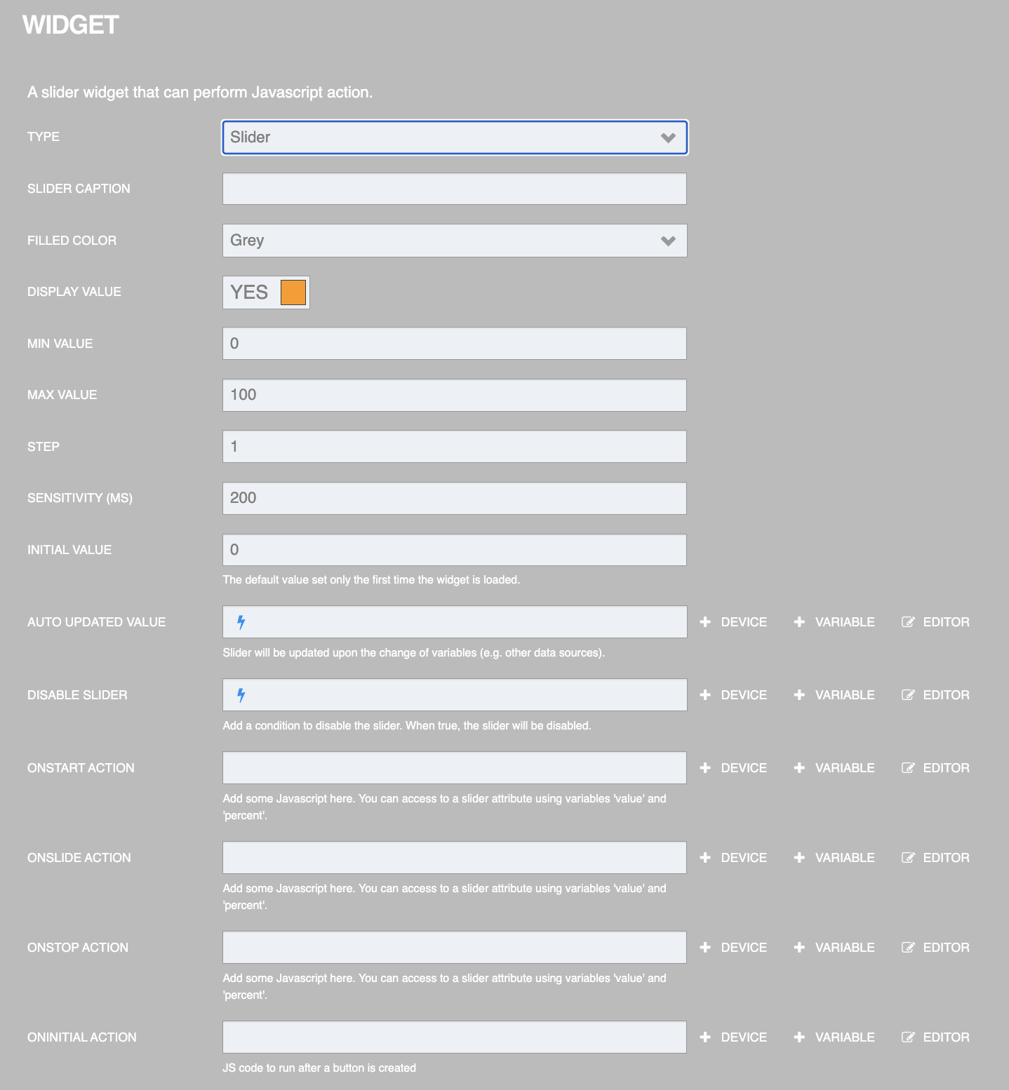
From the figure above, the information that can be specified for setting is as follows:
TYPE is the type of Widget (select Slider).
SLIDER CAPTION is a caption/explanatory text.
FILLED COLOR is the color displayed on the Slider bar when scrolled.
DISPLAY VALUE is the value of the slider that is scrolled, it will be displayed in the upper right corner of the slider.
MIN VALUE is the minimum value that can be specified.
MAX VALUE is the maximum value that can be specified.
STEP is the number of steps to increase/decrease when moving the Slider.
SENSITIVITY (MS) is the sensitivity value.
INITIAL VALUE is the initial value.
AUTO UPDATED VALUE Receives the changed value (syncs with the value in the Platform) and updates the value in the Slider.
DISABLE SLIDER is the condition to be used to disable the slider. When the value is TUREor 1, the slider will be disabled.
ONSTART ACTION is the action that is performed when the slider value is changed.
ONSLIDE ACTION is an action that is performed while the slider is being changed.
ONSTOP ACTION is the action that is performed when the slider is finished changing values.
ONINITIAL ACTION is the first action that occurs when the Slider is created.
Once you have filled in the Widget settings, click the "Done" button in the upper right corner. An example of the settings and the result is as shown in the following figure.
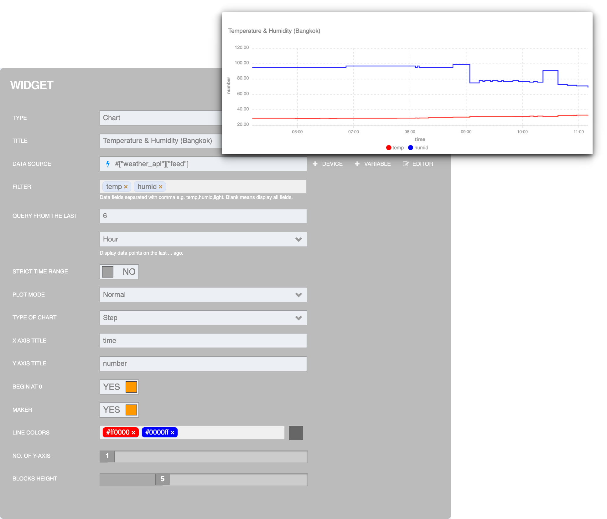
Widget : Chart
It is a Monitoring Widget type widget used to display results in a graph format. It is suitable for displaying data feeds in the platform. The settings screen is as follows:
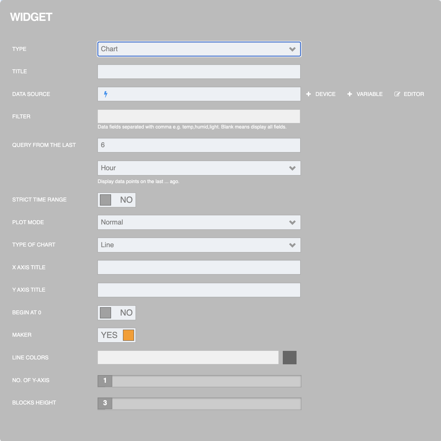
From the figure above, the information that can be specified for setting is as follows:
TYPE is the type of Widget (select Chart).
TITLE is the widget title or field name.
DATA SOURCE is the data source that will display the graph (Datasource values can be retrieved from the Device in the Platform).
FILTER is the data field that you want to display the graph line. If not specified, the system will display all fields.
QUERY FROM THE LAST is to select the range of data to display the graph line by specifying the reference number from the latest time of the data. You can select the following units of time: Second, Minute, Hour, Day, Month, and Year.
STRICT TIME RANGE is the accuracy of the time range.
PLOT MODE is the plotting mode of the graph.
TYPE OF CHART is the type of graph display. There are 2 types to choose from: Line is a normal graph line, Step is a staircase that shows the increase and decrease of values more clearly.
X AXIS TITLE is the X axis title.
Y AXIS TITLE is the Y axis title.
BEGIN AT 0 is ON/OFF start at 0.
MAKER is a command to control the on-off of devices.
LINE COLORS is the color of the graph lines. You can specify it as your own color code or choose a color bar provided by the system. The color assigned to each graph line will match the fields in the order specified in the box
FILTERNO. OF Y-AXIS is the number of Y-axis.
BLOCKS HEIGHT is the height of the block that is displayed on the graph.
Once you have filled in the Widget settings, click the "Done" button in the upper right corner. An example of the settings and the result is as shown in the following figure.